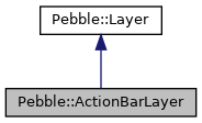
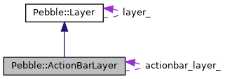
Vertical, bar-shaped control widget on the right edge of the window.
More...
#include <pebble_actionbar_layer.hpp>
Vertical, bar-shaped control widget on the right edge of the window.
◆ ActionBarLayer()
| Pebble::ActionBarLayer::ActionBarLayer |
( |
| ) |
|
|
inline |
Creates a new ActionBarLayer and initalizes it with the default values.
- Background color: GColorBlack
- No click configuration provider (
NULL)
- No icons
- Not added to / associated with any window, thus not catching any button input yet.
◆ AddToWindow()
| void Pebble::ActionBarLayer::AddToWindow |
( |
Window & |
window | ) |
|
|
inline |
Adds the action bar's layer on top of the window's root layer. It also adjusts the layout of the action bar to match the geometry of the window it gets added to. Lastly, it calls window_set_click_config_provider_with_context() on the window to set it up to work with the internal callback and raw click handlers of the action bar, to enable the highlighting of the section of the action bar when the user presses a button.
- Note
- After this call, do not use AppWindow::SetClickConfigProvider() with the window that the action bar has been added to (this would de-associate the action bar's click config provider and context). Instead use SetClickConfigProvider() to register the click configuration provider to configure the buttons actions.
-
It is advised to call this is in the window's
.load or .appear handler. Make sure to call RemoveFromWindow() in the window's .unload or .disappear handler.
-
Adding additional layers to the window's root layer after this calll can occlude the action bar.
- Parameters
-
| window | The window with which the action bar is to be associated |
◆ ClearIcon()
| void Pebble::ActionBarLayer::ClearIcon |
( |
ButtonId |
button_id | ) |
|
|
inline |
Clears out an existing icon.
- Parameters
-
| button_id | The identifier of the button for which to clear the icon |
◆ RemoveFromWindow()
| void Pebble::ActionBarLayer::RemoveFromWindow |
( |
| ) |
|
|
inline |
Removes the action bar from the window and unconfigures the window's click configuration provider. NULL is set as the window's new click config provider and also as its callback context. If it has not been added to a window before, this function is a no-op.
◆ SetClickConfigProvider()
template<class T >
| void Pebble::ActionBarLayer::SetClickConfigProvider |
( |
T & |
owner, |
|
|
::ClickConfigProvider |
click_config_provider |
|
) |
| |
|
inline |
Sets the click configuration provider callback of the action bar.
- Note
- If the action bar had already been added to a window and the window is currently on-screen, the click configuration provider will be called before this function returns. Otherwise, it will be called by the system when the window becomes on-screen.
-
The
.raw handlers cannot be used without breaking the automatic highlighting of the segment of the action bar that for which a button is
- Parameters
-
| owner | The owner of the click configuration provider method |
| click_config_provider | The new click configuration provider |
◆ SetIcon()
| void Pebble::ActionBarLayer::SetIcon |
( |
ButtonId |
button_id, |
|
|
const GBitmap & |
icon, |
|
|
bool |
animated = false |
|
) |
| |
|
inline |
Sets an action bar icon onto one of the 3 slots as identified by button_id. Only BUTTON_ID_UP, BUTTON_ID_SELECT and BUTTON_ID_DOWN can be used. Optionally, if animated is true, the transition will be animated. Whenever an icon is set, the click configuration provider will be called, to give the application the opportunity to reconfigure the button interaction.
- Parameters
-
| button_id | The identifier of the button for which to set the icon |
| icon | Pointer to the GBitmap icon |
| animated | True = animate the transition, False = do not animate the transition |
◆ SetIconPressAnimation()
| void Pebble::ActionBarLayer::SetIconPressAnimation |
( |
ButtonId |
button_id, |
|
|
ActionBarLayerIconPressAnimation |
animation |
|
) |
| |
|
inline |
Sets the animation to use while a button is pressed on an ActionBarLayer. By default we use ActionBarLayerIconPressAnimationMoveLeft
- Parameters
-
| button_id | The button for which to set the press animation |
| animation | The animation to use. |
- See also
- SetIcon()
-
SetClickConfigProvider()
The documentation for this class was generated from the following file:


 Public Member Functions inherited from Pebble::Layer
 Protected Attributes inherited from Pebble::Layer